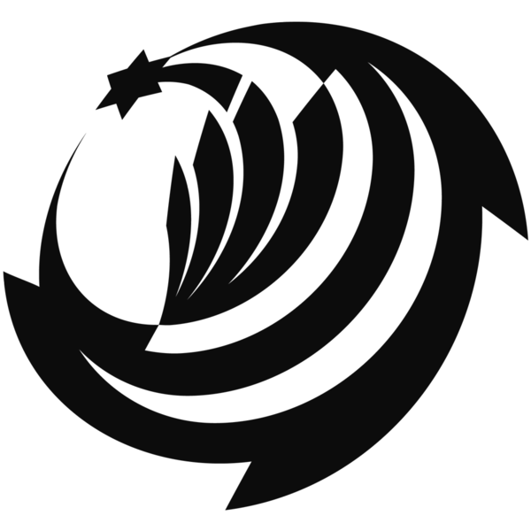
Logotype: Stars'Spring 2008 [Heraldic Logo]
Old-school logo geometries and clear, strong shapes, papercutting, exploring whitespace and silhouettes... everything in highly accurately drawn vectors. The trick is to determine the symbols, find an appropriate representation for each one, hide them within a powerful shape, and forget about them for the legend to be forged.
The Stars'Spring sky disk -- A seal with an aggressive outer ring, an onion theory, some mythology, and lots of force-de-frappe.
Background & making-of at: http://showcase.alexanderbecker.net/2008/04/starsspring-sky-disk.php